Sep 23 2022
7 min read

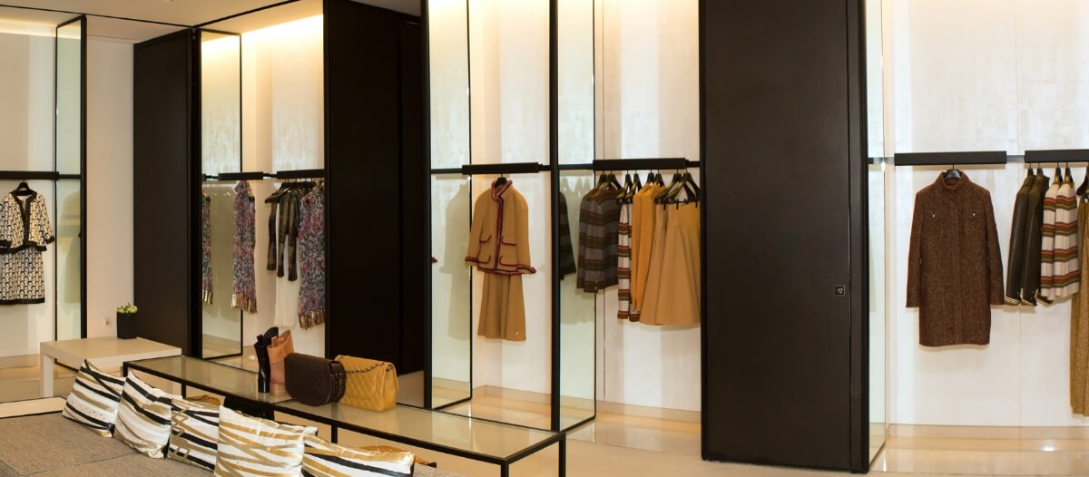
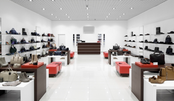
Visual merchandising is essentially a strategy. It blends marketing tactics with design science. Visual merchandising uses all the elements of physical store space to attract consumers’ attention, woo them into the store and then persuade them again to buy a product.
The Collins Dictionary Definition of Visual Merchandising: Visual merchandising is the use of attractive displays and floor plans to increase customer numbers and sales volumes.
Visual merchandising gives each store a unique identity. How a store arranges its products on a shelf, where it places its wall fixtures, and even what content it shows on the retail digital signage displays are all part of visual merchandising. When done right, visual merchandising can use even an empty space to its advantage.
Sustainable visual merchandising focuses on reducing the environmental burden by using organic and ethically-sourced materials in its design. In the recent past, we have seen many brands switching from plastic to paper or recycled material in an attempt to reduce their plastic waste.
Brands like Estee Lauder, Sierra Nevada, Unilever, and Walmart have already taken steps towards sustainable packaging and visual merchandising. Popular QSR chain McDonald’s has targeted to use recycled plastic in Happy Meal toys, straws & trays, and restaurant interior designs.
Also read: How McDonald's digital signage solutions have changed the visual merchandising game across various industries.
Many readers often fail to understand what is meant by ’elements’ visual merchandisers talk about. And there is a justification for that.
The elements of visual merchandising may not always be visible on the apparent. To the ordinary person, the elements are often ‘felt’ rather than ‘seen.’
However, after reading this blog, you will have a clear understanding of the principal elements of visual merchandising. Read on.
Before we delve into the matter, a quick disclaimer: we have only mentioned the five most pivotal elements of visual merchandising. There can be many more elements that affect the visual merchandising design of a store.
Do you ever wonder why a certain product suddenly catches your eye? There are so many items inside a store, yet we get drawn to a particular one. Often, lighting plays a significant role in it.
A typical example can be a jewelry store. Jewelry stores often use spotlights on the more expensive products to guide the customer’s attention to them. And if you carefully notice, you will see that most jewelry store interiors are dimly lit. That allows a better contrast and adds to the shimmers of the jewels.
Store lighting also helps to set the mood. That is why you will see a stark difference between the ambiance of a sports good-selling store and an upmarket luxury fashion boutique.

Another essential element of visual merchandising is texture. Texture is often an abstract concept for non-designers as it tends to be more commonly associated with our ’touch’ perception than our ‘visual’ senses.
However, in visual merchandising, texture can impact both the senses. For example, a rustic store can have actual wooden flooring & walls, or it can use wood-textured designs to give the store a rustic look. Either way, a customer who walks into the store will live history for a second time.

Landscaping is a relatively straightforward element of visual merchandising. It means how the objects are arranged and positioned within a space. The best example of landscaping can be the mannequins in a shop.
Often a shop will have more than one mannequin placed at different angles and positions (some sitting, others standing). Often one mannequin will be elevated higher above its peers using a platform.
Many high-end stores enclose the more expensive products in a casing. This gives an air of exclusivity to the product. That is another example of landscaping in visual merchandising.
These landscaping techniques allow the brand to highlight specific products to make them more desirable.

Also read: Creative trends in visual merchandising for retail window displays
The fourth essential element in visual merchandising is color, as it is directly related to our visual senses. According to Neil Patel, 90% of customers assess a product based on its color alone.
Each color and color group evokes a different emotion in the viewer’s mind. For instance, red and black are associated with boldness, passionate & cheerfulness. In contrast, white, blue, and green colors are often associated with creativity, relaxation, and positivity.
That is why the Disney logo has more blue and white, and the Nike logo is entirely red:

But color can also be a very tricky element for visual merchandisers. The first thing every visual merchandiser must ensure is consistency in color throughout a brand. Jumbled-up colors in branding can confuse the viewers and easily remove a brand from their memory.
Think of Starbucks for a moment. Their brand color cluster includes green, white, black, brown, and beige. It is consistent across their shop signage, logo, menu boards, store furniture, interior decorations, cups, coffee packs, and even the content on digital screens.
And the reason for choosing this color group? Well, I can smell some coffee here!

Do you ever feel like straightening a crooked photograph hanging from the wall? I guess we all know that feeling. But why do we have that urge?
That’s where balance comes in.
Like any other domain, balance is vital for visual merchandising too. It brings a sense of visual satisfaction to our brains. We humans like order. Balance allows our brain to capture the maximum visual reception in a single frame. That is why it is such a powerful element in visual merchandising.
Stores that can nail balance will succeed in exposing more products in their customers’ line of vision. Take a look at the two images below. Which one do you think will a shopper prefer?


You didn’t think we would miss including the most entertaining element in visual merchandising, did you?
Technology cannot be ignored from today’s standpoint. As more and more brands are using new-gen tech to catch the attention of modern digital-loving shoppers, it is becoming increasingly important to do it the right way.
For example, many luxury fashion houses like Stella McCartney have demonstrated excellent visual merchandising with digital signage.
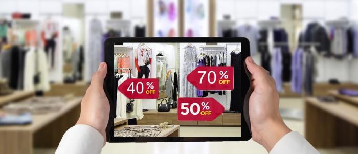
Digital screens or digital signage are standard these days everywhere you go, including retail stores. These displays at various strategic locations can help show product information, offer retailtainment, and even help in self-service to make the overall customer experience worthwhile.
But visual merchandisers need to be well aware of how to use these screens to their advantage. As far as using digital signage solution for visual merchandising is concerned, the critical consideration is screen placement.
For example, repurposing user-generated digital signage content as marketing material is trending these days. It is simple and effective.
However, screens showing any user-generated content, such as an Instagram product review, need to be placed near the product shelf or on a large screen located centrally. Because these are points of purchase where the customers have maximum intent to buy a product.

For brands, visual merchandising holds great importance. This is because of the benefits good visual merchandising brings. The following is a discussion of some of the top benefits:
As mentioned before, visual merchandising imparts eccentricity to each brand. For example, a fashion brand can sell funky T-shirts or elegant evening gowns. Accordingly, their target groups will be different. And based on their brand voice, the visual merchandising of the store will change.
Also read: How corparate branding is changing with the help of digital signage
If done effectively, visual merchandising can attract customers and guide them toward the products they need. It can also help them to discover new products and solutions.
Also, some people lack the power of imagination, and they fail to understand what accessories will complement their outfits. So, if a mannequin is adequately styled, it can encourage the customers to buy the accessories with the dress. That means better business for the brand.
Let’s say the visual merchandising of your store window successfully brought more customers. You could even upsell your products. Now what?
What if the customers do not remember your store the next time they are out shopping? That is why it is essential to leverage in-store visual merchandising to retain customers.
A customer who could easily find the products they were looking for in a store would remember the brand and return to the same store next time.
Check out: Creative in-store visual merchandsing> examples by top brands
Visual merchandising is ultimately a mix of both science and art. While there are several principals of visual merchandising, it is ultimately your brand voice that needs to reflect through the design. As visual merchandising trends keep changing, it is important for brands to also evolve in their creativity.


Sep 23 2022
7 min read
![What are 3D digital billboards for advertising? [5 Examples]](/blog/images/3d-advertising-billboard/banner_hu3a52995533a2f5f6af3321531a883f0d_86539_700x0_resize_q75_box.jpg)
Sep 8 2022
6 min read

Sep 6 2022
9 min read

Aug 18 2022
6 min read
Take complete control of what you show on your digital signage & how you show it.
Start Free Trial Schedule My DemoSee How Amazon Solved Retail Marketing Challenges – Boosted Sales & Conversions by Almost 27%
Unlock Exclusive Insights